Manufacturing and Distribution
 Firearms
 Automotive and OEMs
 Healthcare & Life Sciences
 Sports & Outdoor Hunting Gear
 Adobe Commerce
 BigCommerce
 Magento
 myMagento
 WooCommerce
 Shopify Plus
 Shopware
 Magento 1 to Magento 2 Migration
 Magento Upgrade Service
 Magento Design
 Magento B2B
 Magento Hosting
 Magento Consulting
 Magento eCommerce Developers
 Magento SEO
 Magento Integration
 Magento Speed & Performance Optimization
 eCommerce Development
 eCommerce GrowthX
 B2B CRO Services
 Enterprise SEO Services
 Email Marketing
 Website Localization Services
 Data Analytics Services
 GrowthX Strategy & Consultancy
 eCommerce Integration
 eCommerce Site Migrations
 Project Rescue
 Hire Developers
 Free Audit Report
 Extensions & Applications
 Custom Applications for eCommerce
 Magento Extensions
 User Interface & Experience
 Website Design Services
 Support & Maintenance
 About Us
 Blog
Blog Webinars
 News & Updates
 Downloads
 FAQs
FAQs The Wagento Difference
 Hyvä
Hyvä iPaaS
iPaaS Klaviyo
 Sales Layer
 Sift
Sift Dot Digital
 Nousmedis

Your website’s user experience (UX) can either keep site visitors there and turn them into leads or drive them away. Even little changes can make a significant difference in your conversion rates.
What Makes a Great Website Experience?
According to Netcraft, there are approximately 1.145 billion websites responding to pings. The number fluctuates from month to month as businesses open and close. People expect some standard mechanics, such as an easy-to-locate navigation bar and calls to action (CTAs).
Although there are dozens of factors to consider when improving the UX of a site, here are the top five for maximum impact.
1. Embrace White Space
Don’t fill up every spare inch of empty space on your pages. You need a nice balance between negative and positive space, so users don’t feel overwhelmed. You also must keep the focus on the goal of the page, which is easiest when you limit the elements added.

The Pyramids of Meroe website utilizes a video for the background. Although an image fills the screen, it serves as negative space for the page. Note how the headline is centered and draws user attention. They know exactly where they landed and what they’ll get from the page.
2. Speed Up Your Site
People are busy. They won’t wait around long for your site to load, especially on mobile devices, where they might be hopping on during a short break. The UX can be good in every other way, but if your site doesn’t load within a few seconds, the visitor will never know it.
Talk to your server about plans to speed up your site. To improve your website’s user experience, get rid of scripts or plugins bogging it down. Start caching and work to ensure everything runs as speedily as possible.
3. Include CTAs
Calls to action can encourage your audience to take the action you want them to take. Figuring outplacement, appearance, and language impacts your conversion rate. Try different combinations and use multivariate testing to see what visitors respond to.
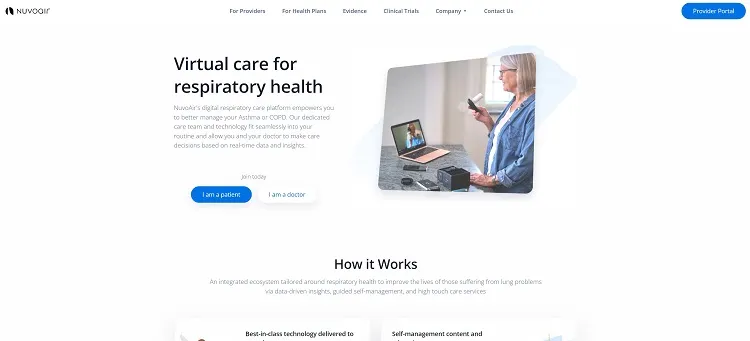
Nuvoair uses CTAs to help reach the objective for the landing page. Note how some of the buttons are in bold blue, which shows the most common action taken when on the page. However, they also have a white button with blue letters for doctors to click on.
The CTAs appear above the fold. They are large to draw the eye. They also pop against the white background. When someone lands on the site, there’s no question about what the objective of the page is.
4. Rework For Scannability
People like to skim over websites and get the general idea before digging deeper. Look at how easy it is for people to read your page. To improve your website’s user experience, you should break big blocks of information up into separate headings. Add bullets. Use images to create a break for the user’s eyes.
If you can’t skim over the text and get an idea of what the page is about, it needs more work for user-friendliness.
5. Select Unique Images
Big, beautiful images can tell a lot more to your readers than text alone. It’s best to use unique images when you can rather than stock photos. What makes your product or service unique and how can you show that with visuals?
The human brain processes picture much faster and more efficiently than text alone. Combining both text and photos adds another element to the usability of your site that appeals to most people. Don’t forget alt tags for any visual impairments or those who choose to turn off image viewing.
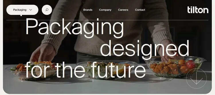
Tilton uses images to draw the user in and highlight the advantages of their product. Another thing we love about this site is how they animate bowls. As the user scrolls down, it wobbles from side to side and then disappears behind a headline.
Animating your images can add an extra dimension to your design without changing the overall feel of the site.
Stand Out from the Competition
Spend time looking at your competitor’s websites. Anything you can do to meet user expectations while still standing out improves the odds customers will stay on your site. Make changes, test the response and keep adjusting until you have the conversion rate you desire.